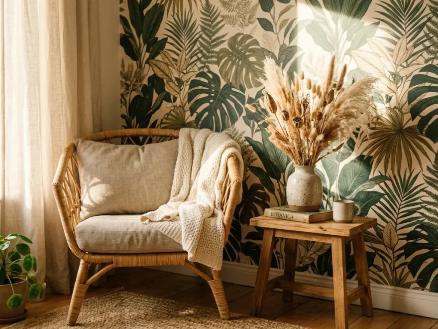
1. Accent Wall Behind the Bed
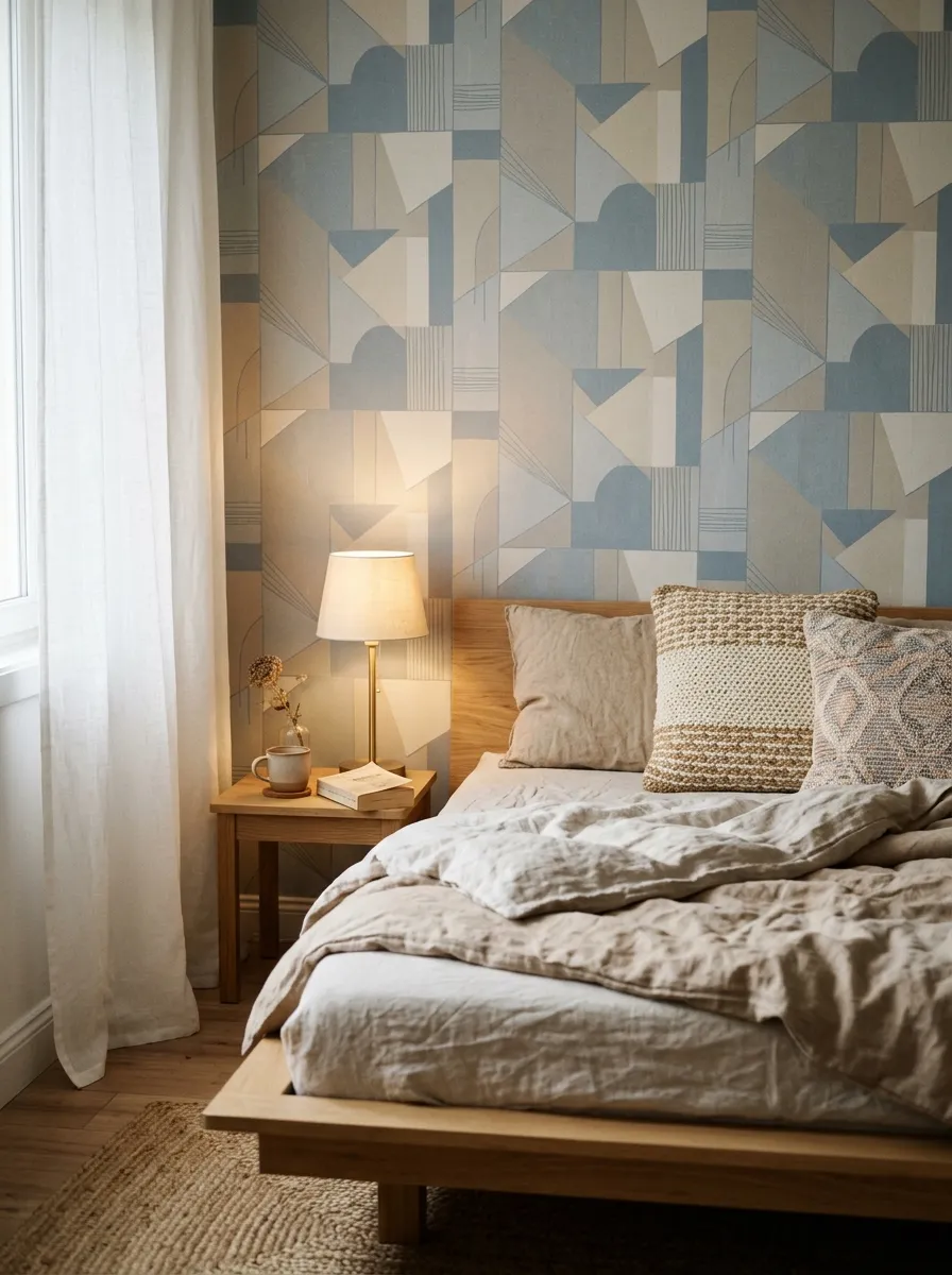
The wall behind your bed is the first thing you see and the last thing you notice at night. That makes it the smartest place to start. You only cover one wall, so you use less material and spend less money.
Pick a pattern that feels calm. Soft greens, muted blues, or a small repeat print work well for sleep.
Peel and stick rolls keep this beginner friendly. Measure your wall, add a little extra for trimming, and buy one roll more than the math says. That spare saves you on the last strip.
Line up your first panel with a level, not the corner. Corners lie. A level tells the truth.
Skip a headboard and let the pattern act as one. That single swap saves you the cost of new furniture.
If you rent, removable paper peels off clean when you leave. Your deposit stays safe.
Keep your bedding simple so the wall stays the star. Plain white or oatmeal sheets let the pattern breathe.
One wall. One weekend. A bedroom that feels finished.
2. Peel and Stick Panels for Renters
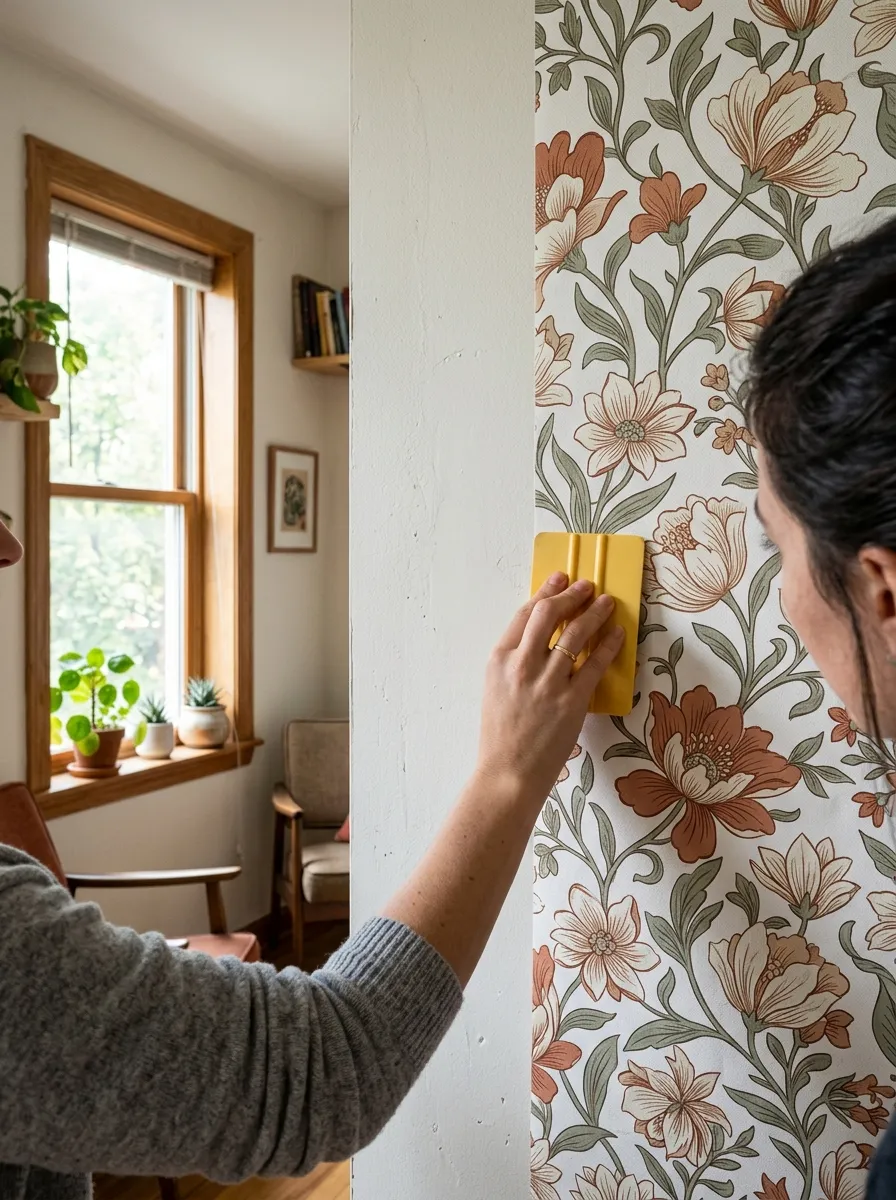
Renters get the short end of decor. Landlords say no to holes and paint. Peel and stick paper says yes to everything.
These panels stick with an adhesive backing. No glue, no paste, no mess. You pull off the film and press the paper to the wall.
Test one small piece first. Some older paint pulls off with the paper. A quick corner test tells you if your wall is safe.
Buy per panel, not per room, when you start. This keeps the cost low while you learn the feel of the material.
Work slow. Smooth from the center out with a card or a clean cloth. Bubbles push toward the edges and disappear.
Focus on rooms you use most. A small bathroom or an entry hall gives you a big visual return for very little paper.
When you move, warm the corners with a hairdryer and peel gently. The wall stays clean underneath.
Save the leftover scraps. They cover switch plates, drawer fronts, and small shelves for free. One roll stretches further than you think.
3. Wallpaper on the Ceiling
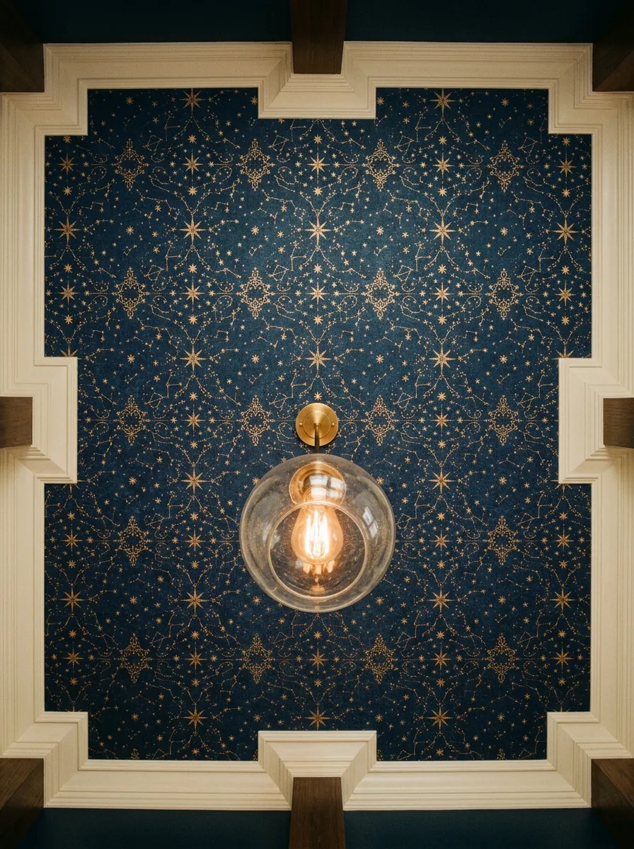
Most people forget the ceiling exists. Decorators call it the fifth wall for a reason. Cover it, and a plain room suddenly feels designed.
Small rooms handle this best. A powder room, a nook, or a tiny bedroom feels cozy with a papered ceiling.
Pick a small repeating pattern. Big shapes overwhelm a low ceiling. Tiny stars, dots, or a fine print keep it easy on the eye.
This job takes two people. One holds the paper, one smooths it. Your arms will thank you.
Keep the walls quiet. Paint them a soft neutral so the ceiling gets all the attention. That balance stops the room from feeling busy.
For a cheap version, cover just the center panel above a light fixture. You use one strip and still get the effect.
A step stool and a friend cost nothing. The paper is your only real expense.
Look up every day and enjoy it. This is the detail guests always mention because nobody expects it.
4. Bookshelf Backing Pop
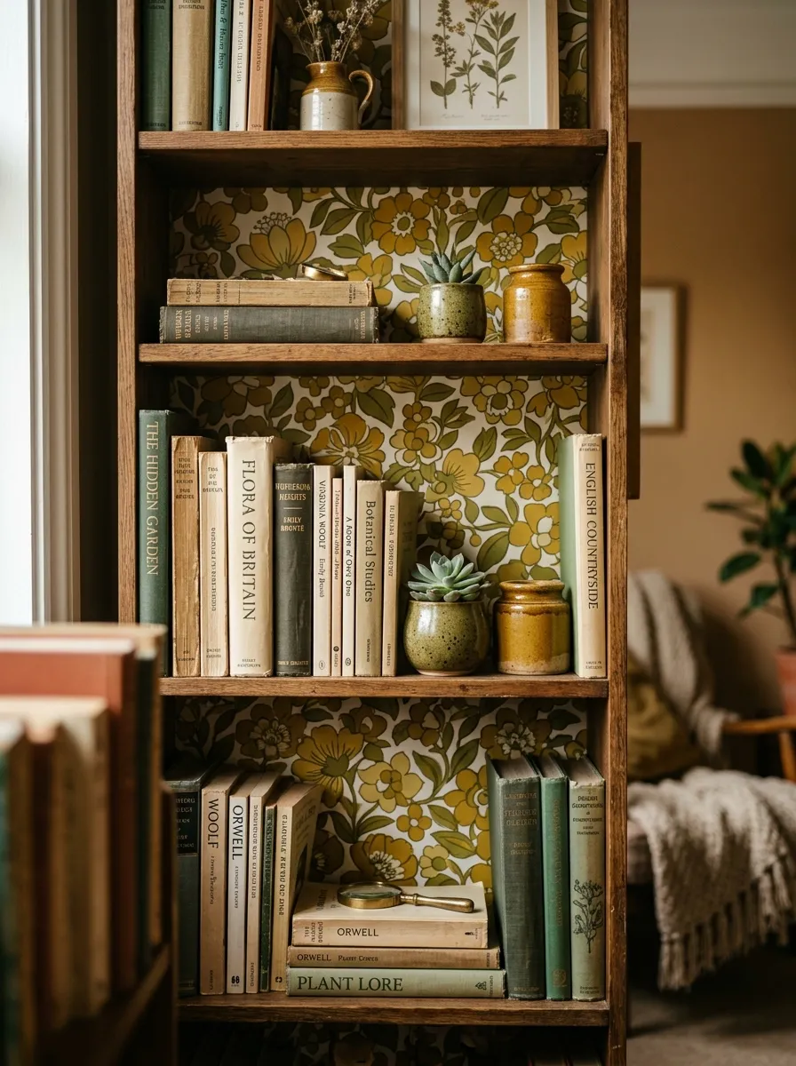
An empty bookshelf back is a blank canvas hiding in plain sight. Line it with paper and every shelf gets a warm frame.
You need very little material here. The back panels are small, so leftover scraps often finish the whole unit.
Measure each panel and cut your pieces to fit. Peel and stick paper works best because the surface stays flat and easy.
Pick a color that contrasts your books. A deep green or a warm ochre makes pale spines and pots stand out.
For open shelving, do the same trick on the wall behind it. The pattern peeks through the gaps between your objects.
This idea costs almost nothing. Old wallpaper samples, one leftover roll, or even sturdy gift wrap can do the job.
Style the shelves lightly after. Leave breathing room so the pattern shows. A crowded shelf hides your work.
Try it on a plain store cabinet to make it look custom. That small detail lifts cheap furniture into something personal.
5. Powder Room Statement
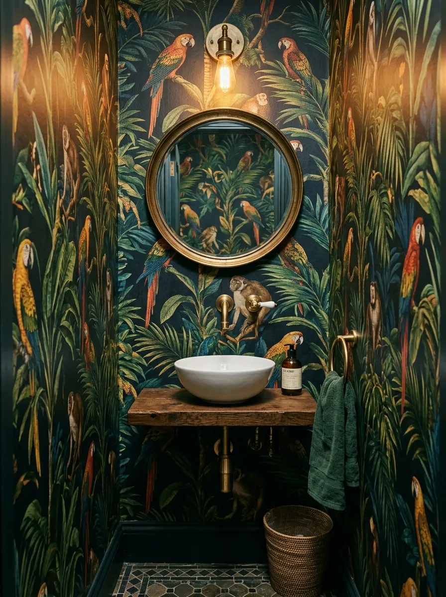
A small bathroom is the one place you can go bold with zero risk. Nobody spends the night in there. So you can pick the loud pattern you would never dare put in a bedroom.
The tiny footprint keeps costs down. Most powder rooms take one or two rolls, which makes even pricey paper affordable.
Go dark and dramatic if you love it. Deep greens, black florals, or a wild print feel rich in a small space.
Choose vinyl or a wipeable finish. Bathrooms get steam, and a wipe clean surface lasts far longer.
Keep the fixtures plain. A simple white basin and a round mirror let the walls do all the talking.
A single warm bulb makes the color glow at night. Skip harsh white light that flattens the pattern.
For a budget version, paper only the wall behind the sink. You get the drama for half the paper.
This is the room where guests linger. A brave pattern turns a forgettable space into the one people talk about.
6. Stair Riser Patterns
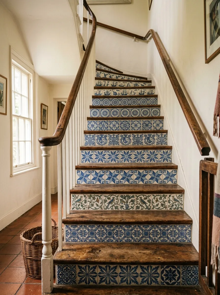
Stairs get walked on and ignored. The vertical risers are dead space begging for color. Paper them and a plain staircase turns into a feature.
Each riser is small. That means offcuts and leftover strips cover the whole run for very little money.
Cut each strip to the exact riser height. Measure a few, because older stairs are rarely identical. A steady hand and a sharp blade do the rest.
Mix patterns for a playful look. A different tile print on each step feels handmade and full of character.
Or keep it uniform for a calmer feel. One repeating pattern down every riser looks clean and tailored.
Seal the paper with a clear matte varnish. Stairs take abuse, and a topcoat keeps the edges from lifting.
This project turns wallpaper scraps into art. Collect samples, leftover rolls, or even sturdy patterned paper to fill each step.
Start at the bottom step and work up. That way any small trimming errors land where feet hide them.
7. Framed Wallpaper Art
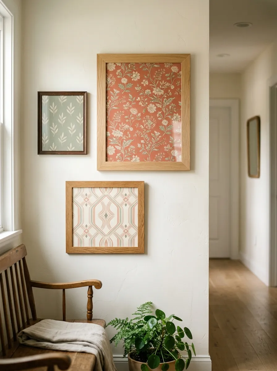
Real art costs money. Wallpaper offcuts cost almost nothing. Frame them and you get gallery walls for the price of a roll.
Grab leftover samples from a hardware store. Many are free or nearly free, and each one becomes a small print.
Cut the paper to fit cheap frames from a thrift shop. Mismatched frames actually look better, so hunt for bargains.
Pick two or three colors that talk to each other. A shared palette ties random patterns into one calm group.
Lay the frames on the floor first. Move them around until the spacing feels right, then hang.
Odd numbers look natural. Three or five frames feel more relaxed than a stiff even row.
This works over a sofa, up a staircase, or along a narrow hall. Any blank wall welcomes it.
Swap the paper inside whenever you want a change. The frames stay, the mood shifts, and you spend nothing.
One roll of paper fills a dozen frames. That is the cheapest gallery wall you will ever make.
8. Entryway First Impression
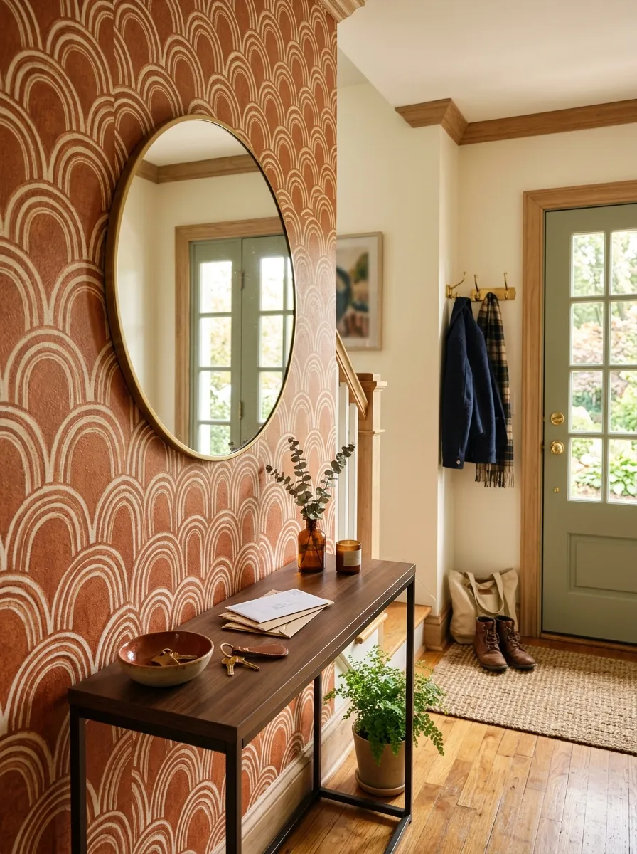
The entry sets the tone for the whole home. It is the first thing you see coming in and the last thing leaving. A papered wall here greets everyone at the door.
Entryways are usually small. That keeps your paper cost low while giving a big first impression.
Pick a warm, welcoming pattern. Terracotta, soft gold, or a gentle arch print feels like a hug at the threshold.
Add a slim console table below. Even a narrow shelf gives the wall purpose and a spot for keys.
Hang a mirror over it. The reflection bounces light and makes a tight entry feel open.
For rentals, removable paper keeps this landlord safe. It peels away clean on moving day.
If space is tight, paper only the wall facing the door. That is the one everybody sees first.
Keep the floor clear. A single basket for shoes stops the whole look from feeling cramped.
A good entry makes a small home feel intentional. One wall does most of that work.
9. Kitchen Backsplash Vinyl
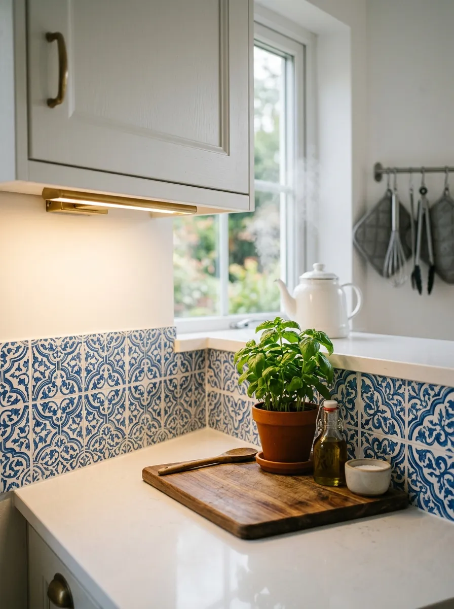
Real tile is expensive and permanent. Vinyl wallpaper fakes the look for a fraction of the cost. Behind a counter, few people can tell the difference.
Choose a wipe clean vinyl made for kitchens. Splashes and grease wipe right off, so the surface stays neat.
Measure the area between your counter and cabinets. This strip is narrow, which keeps the material cheap.
Clean the wall first. Grease is the enemy of adhesive, so a good degrease helps the paper grip.
Press from one side to the other and smooth as you go. A card pushes out air and locks it down.
Seal the edges near the stove with a clear caulk line. That stops steam from creeping under the paper.
Tile print patterns hide seams well. The grid lines cover any small joins between strips.
For a rental kitchen, this is a lifesaver. It looks custom and peels off when you leave.
A whole backsplash for the cost of one dinner out. That trade is hard to beat.
10. Closet Interior Surprise
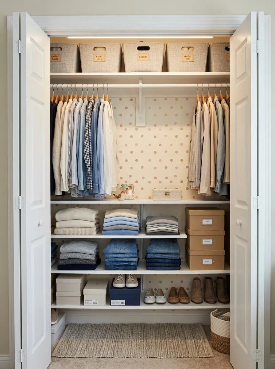
The inside of a closet is your secret canvas. Nobody sees it but you. That makes it the perfect low pressure spot to try a pattern you love.
Closets are small and often left over paper covers them completely. This is the cheapest project on the list.
Pick something cheerful and bold. A print too loud for a bedroom feels playful hidden behind a closet door.
Line the back wall first. That is the surface you face when you open the door each morning.
Peel and stick paper suits this best. Closets have odd corners, and repositionable paper forgives your mistakes.
Add it to the shelf edges too. A thin strip of pattern on each ledge finishes the look.
This small joy costs almost nothing. Any leftover roll or a single cheap sample sheet does the job.
A pretty closet makes getting dressed feel less like a chore. A tiny burst of pattern starts your day with a smile.
11. Playful Kids Room Prints
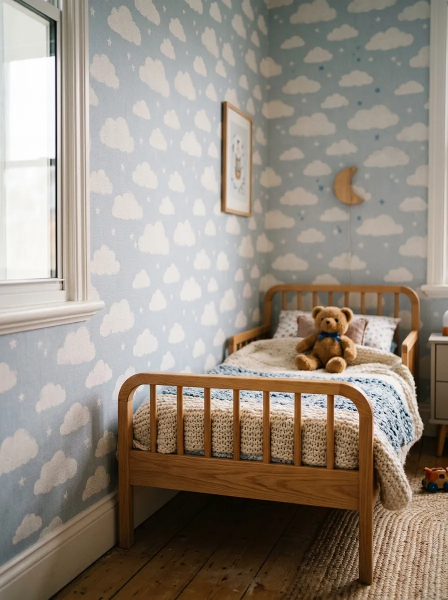
Kids grow fast and their tastes change faster. Removable paper lets you switch themes without a big spend. This year clouds, next year dinosaurs.
Peel and stick paper wins here. When the phase ends, it comes off clean and a new look goes up.
Pick a soft, calming print for the sleeping wall. Gentle clouds or stars settle a busy little mind at bedtime.
Save bold patterns for a play corner. One loud wall by the toys keeps the energy where it belongs.
Let your child help pick. A kid who chooses the pattern feels proud of the room.
Stick to one accent wall. Papering all four can feel too much in a small bedroom.
For a cheap update, cut paper shapes and stick them like stickers. Clouds, hills, or dots go up in minutes.
Removable paper protects your walls from crayons too. When the marks appear, you swap the panel instead of repainting.
A themed wall makes bedtime and playtime feel special without a big budget.
12. Mixing Two Patterns
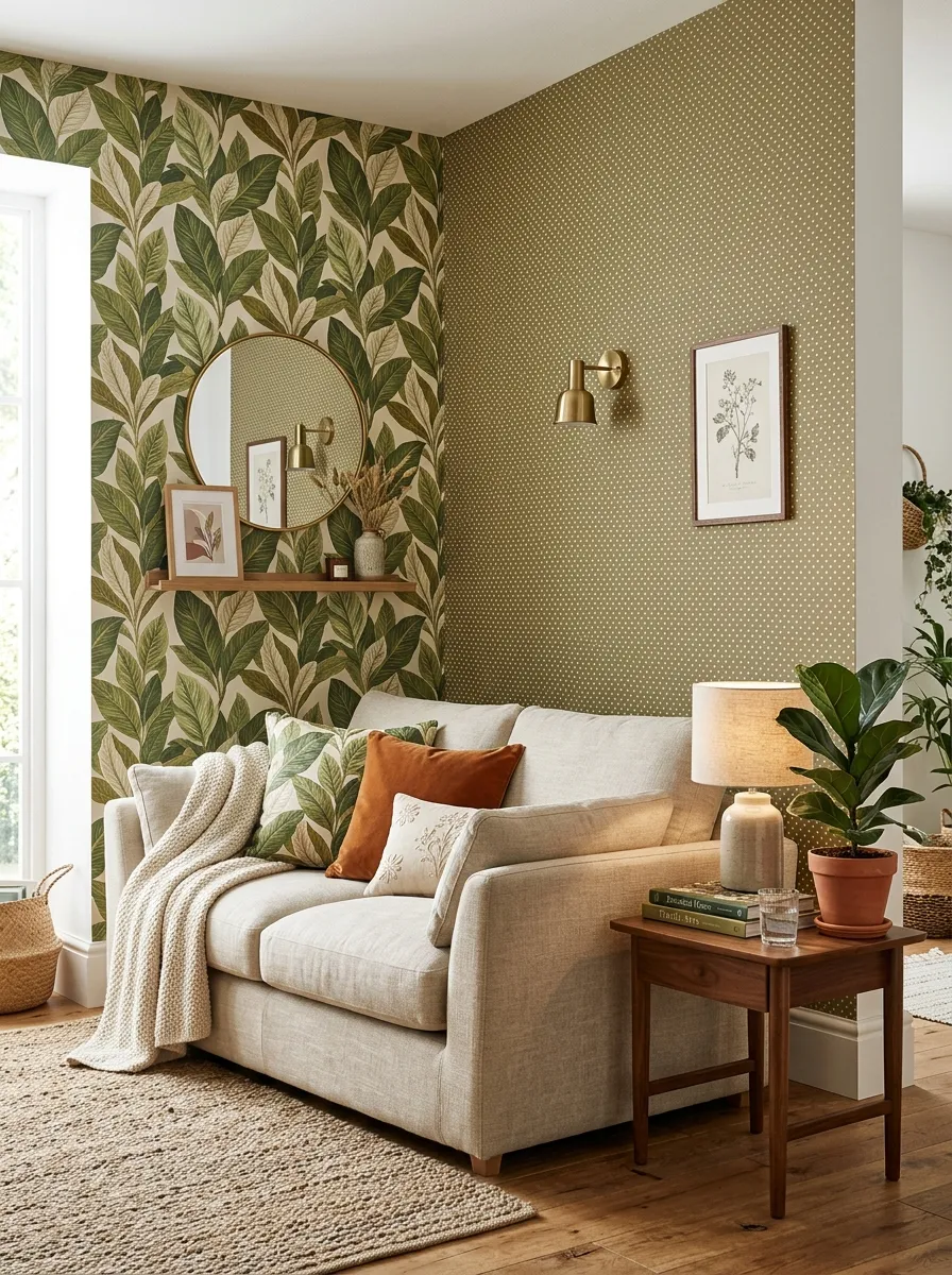
Two patterns in one room sounds risky. Done right, it looks collected and rich. The trick is sharing a color, not a scale.
Pick a large print and a small print that share one shade. A big leaf pattern and a tiny dot in the same green read as a pair.
Use the bold pattern on a main wall. Save the quiet one for a smaller surface like a nook or ceiling.
Keep the palette tight. Two colors across both patterns stop the room from feeling chaotic.
Break them up with plain space. A stretch of neutral wall between the two lets each one breathe.
This idea stretches leftover rolls. Two half used rolls finally have a purpose together.
Test with samples taped side by side. Live with them a day before you commit.
Furniture should stay simple. Solid colors ground the room when the walls carry the pattern.
Matching tones do the heavy lifting. Once the colors agree, the patterns follow.
13. Grasscloth Texture for Warmth
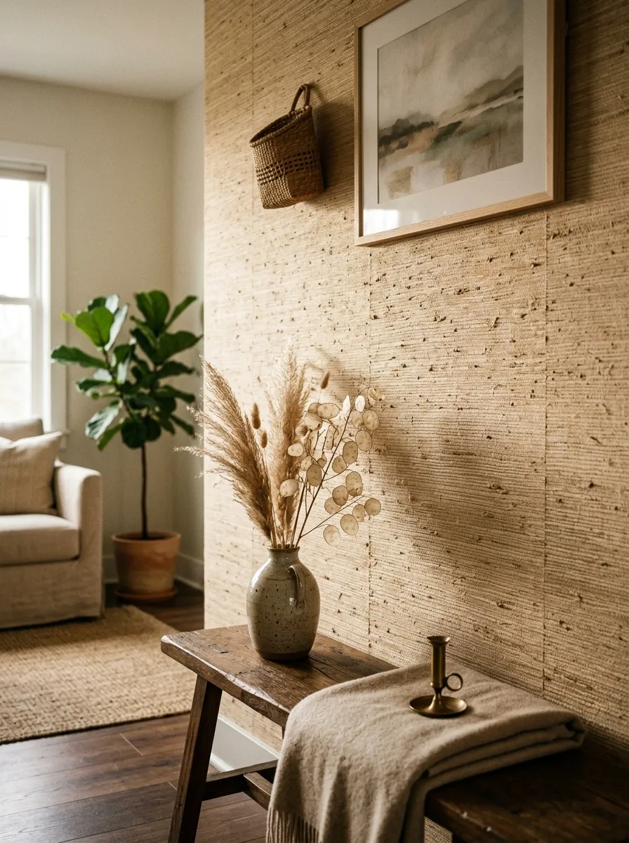
Flat walls can feel cold. Grasscloth adds texture you can almost feel. It brings warmth without any color at all.
The woven fibers catch light in a soft way. A plain oatmeal wall suddenly has depth and quiet interest.
Real grasscloth costs more, so use it in one small space. An entry, a nook, or one accent wall keeps the price sane.
For a cheaper route, look for textured vinyl versions. They copy the woven look and wipe clean too.
Hang it with care. Grasscloth shows seams, so plan your strips before you cut.
Keep the room neutral around it. The texture is the feature, so loud colors would fight it.
Warm lighting brings out the weave. A soft bulb angled across the wall makes the fibers glow at night.
This look pairs well with wood and linen. Natural materials next to grasscloth feel calm and grounded.
Texture reads as expensive even when the room is simple. One warm wall carries the whole feeling.
14. Half Wall Wallpaper
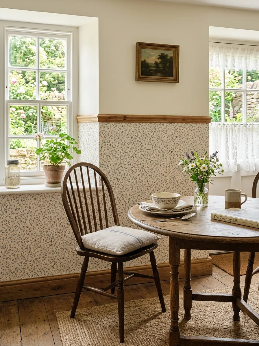
Papering half a wall uses half the paper. That alone makes it a smart money move. It also looks charming and classic.
Run the pattern on the bottom and paint above. A thin wood strip covers the join and finishes the line.
Measure a consistent height all the way around. A level pencil line keeps the top edge straight and neat.
Pick a small, cottage style print for the lower half. Little florals or checks suit this look best.
Match the paint above to a color pulled from the paper. That link ties the two halves into one idea.
This works in dining rooms, halls, and kids spaces. The pattern sits where scuffs happen, and the paint stays clean up high.
For a cheaper trim, use a simple painted line instead of wood. A steady hand and painter tape do the job.
Half the height means half the cost. You get a designed wall without buying a full room of paper.
15. Door Panel Detail
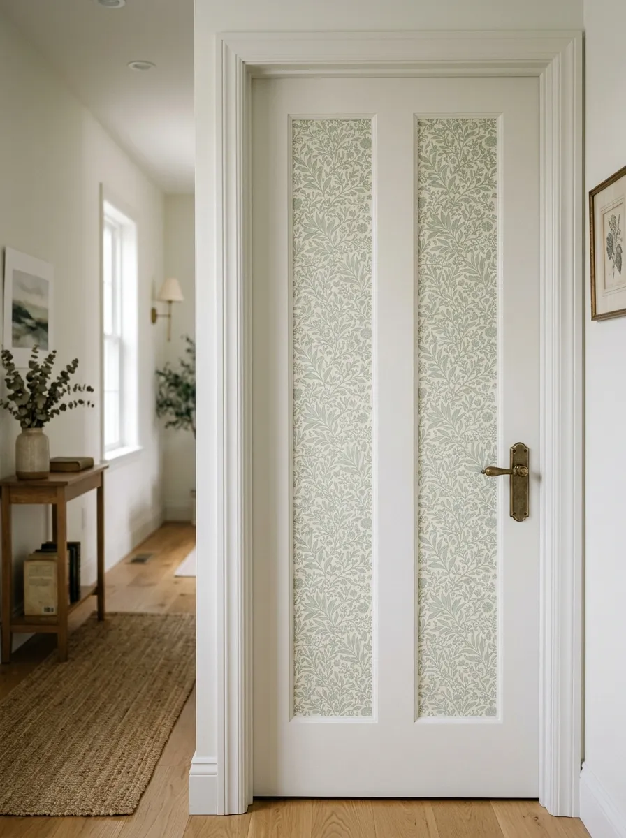
A plain door is a missed chance. Fill the panels with paper and a boring door becomes a small surprise. It costs a scrap of material.
Most doors have sunken panels perfect for this. Measure each one and cut your paper to fit inside the frame.
Use peel and stick paper so the edges sit flat. Press it firmly into the corners for a clean finish.
Pick a pattern that suits the door color. A soft print inside a white frame looks tailored and calm.
Do a closet door first to practice. It is low stakes and quick.
This uses tiny amounts of paper. A single leftover strip covers several panels.
For rentals, it peels away clean and leaves no mark. Your landlord never knows.
Seal the edges with a light hand if the door gets touched often. A clear topcoat keeps the paper from lifting.
One door detail makes the whole hall feel considered. Guests notice it without knowing why.
16. Cozy Reading Nook
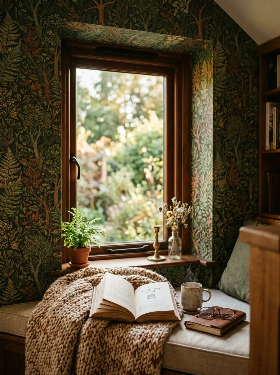
A reading nook is a small pocket of calm. Wrap it in pattern and it feels like a little world of its own. The tight space keeps paper costs low.
Pick a deep, cozy print. Forest greens, warm browns, or a soft botanical make the corner feel like a retreat.
Paper the wall around the seat. If there is a window, run the pattern up to the frame for a wrapped feeling.
Add a cushion and a soft throw. These finish the nook and cost little from a thrift shop.
Keep the light warm and low. A small lamp turns the corner into an evening escape.
Under a stair or in a bay window works perfectly. Any small alcove welcomes this treatment.
Use leftover paper from a bigger project. A nook rarely takes more than a roll.
The smaller the space, the bigger the pattern can be. A bold print feels snug here, not loud.
A papered nook becomes the seat everyone fights over.
17. Faux Headboard with Wallpaper
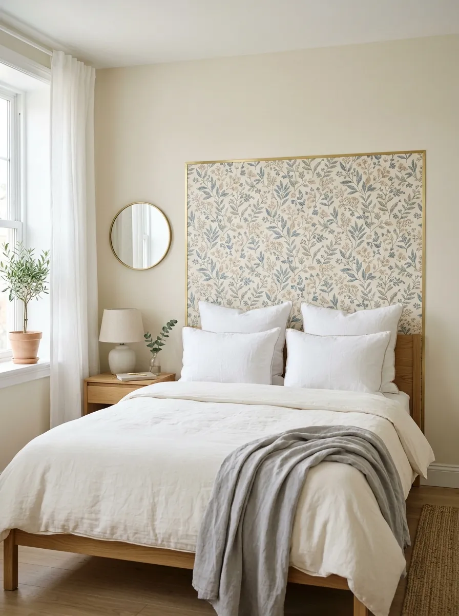
Headboards are bulky and pricey. A wallpaper shape does the same job for a few dollars. It marks the bed without taking up space.
Cut a rectangle or arch of paper the width of your bed. Stick it on the wall behind the pillows.
Peel and stick paper makes this simple. You can lift and reposition it until the shape sits right.
Outline it with thin trim or painter tape for a framed look. That edge makes it read as a real headboard.
Pick an arch shape for a soft, modern feel. A curved top looks intentional and calm.
Center it over the bed with a pencil mark first. Balance matters here more than anything.
This suits small bedrooms where a real headboard would crowd the room. The wall stays flat and open.
For rentals, it peels off clean and saves your deposit.
A shape of paper replaces a whole piece of furniture. That is a big look for a tiny spend.
18. Home Office Video Backdrop
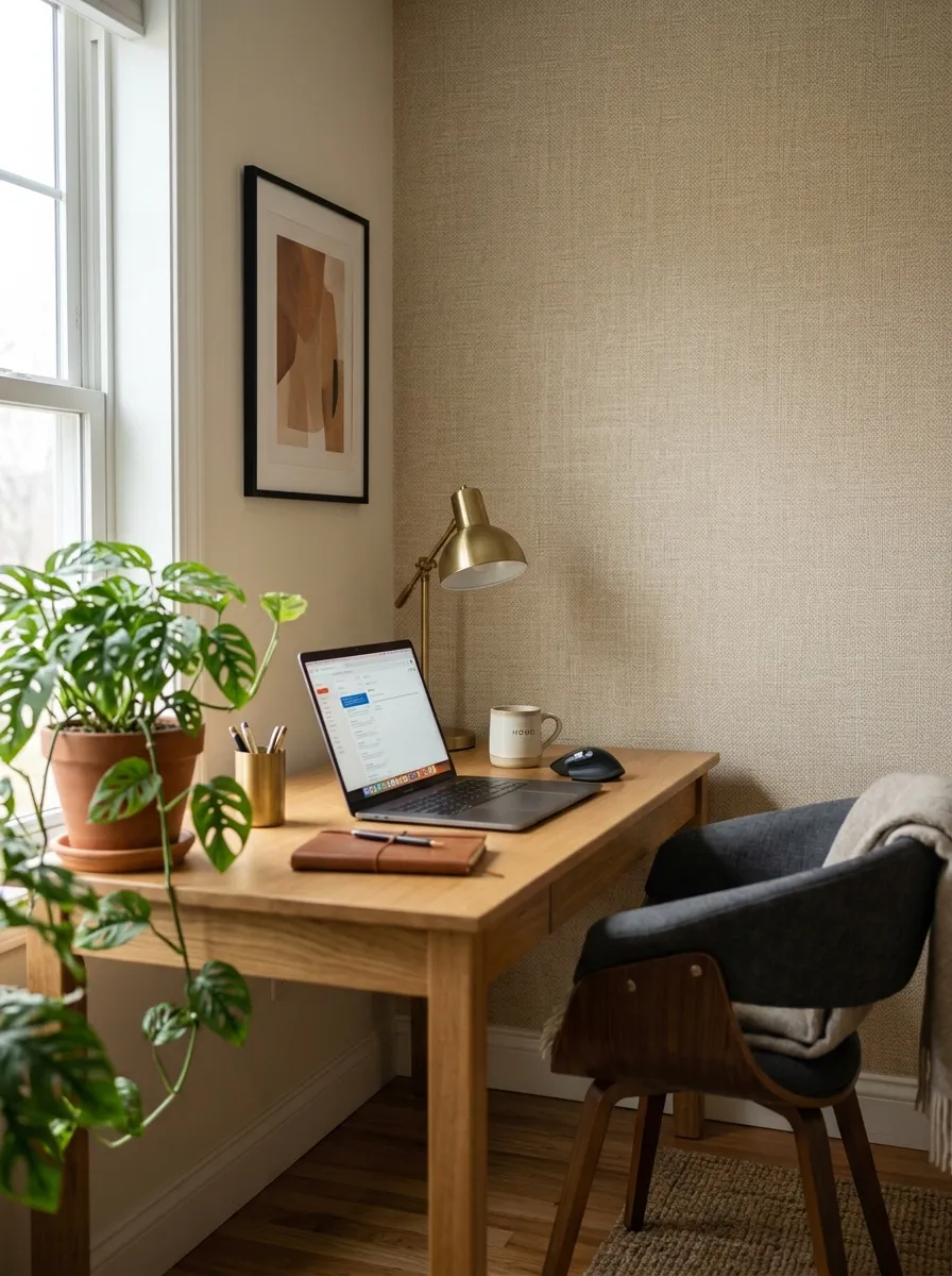
Video calls put your wall on display. A papered backdrop makes you look organized and calm. It reads as a set instead of a spare room.
Paper only the wall your camera sees. That keeps the cost to a single strip or two.
Pick a subtle, textured pattern. Soft neutrals and quiet prints look professional and do not distract on screen.
Avoid busy patterns that flicker on camera. A calm surface keeps the focus on your face.
Add a plant or a shelf in frame. These small touches make the backdrop feel styled, not staged.
Keep the color warm. Beige, sage, or soft clay flatter skin tones on video.
For a cheap fix, paper a folding screen instead of the wall. You move it wherever you need it.
Removable paper suits a rented office. It comes down clean when the lease ends.
A calm wall behind you signals that you have it together. Colleagues notice the polish even if they cannot name it.
19. Moody Dark Walls
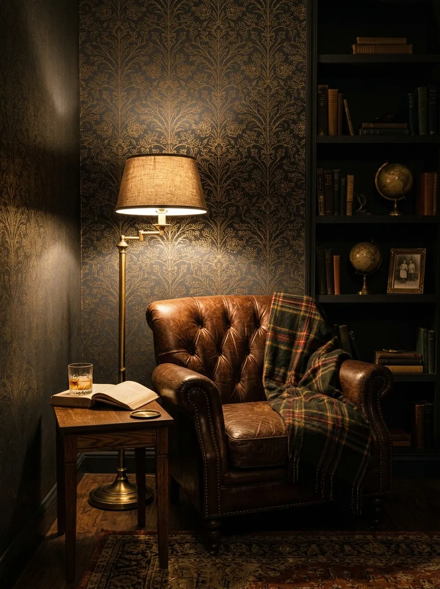
Dark walls sound scary. In the right room they feel warm and enclosing. A moody paper turns a plain space into a snug retreat.
Choose a deep base with fine detail. Charcoal, navy, or forest green with a subtle print reads rich, not heavy.
Use it in a room without much daylight. Dark colors love low light and make the space feel intentional.
Balance it with warm bulbs. Soft golden light stops a dark room from feeling like a cave.
Add a few brass or wood touches. Warm metals and natural wood glow against a dark wall.
Keep the floor and ceiling lighter. That contrast keeps the room grounded and open.
Try it first in a den, study, or small lounge. These rooms suit the cozy, tucked away mood.
For a cheaper test, paper one wall only. You get the drama at a quarter of the cost.
Dark does not mean small. With warm light and a fine pattern, a moody room feels like the best seat in the house.
20. Botanical Prints for Calm

Plants calm a room, and botanical paper brings that feeling to your walls. Leaves and vines make a space feel soft and alive. You get the greenery without the watering.
Pick a muted, leafy print. Soft sage and cream feel restful, while bright jungle prints feel lively. Choose by mood.
Use it where you want to unwind. A bedroom, a bath, or a reading corner suits this calm look.
Pair it with real plants below. The paper and the living leaves echo each other for a fuller effect.
Keep furniture natural. Wood, rattan, and linen sit beautifully against a botanical wall.
Large leaf prints work best on a single accent wall. Papering the whole room can feel busy.
For a smaller budget, frame a few panels instead of covering a wall. You get the green without the full spend.
Leaves never go out of style. A botanical wall stays calm and current year after year, which makes the spend worth it.
Conclusion
Wallpaper is the fastest way to give a room a point of view. You saw 20 ways to use it here, from a bold powder room to a quiet reading nook, from framed offcuts to a papered ceiling nobody expects. Most of these cost little because they use one wall, a few panels, or leftover scraps you already have. Peel and stick paper keeps the whole thing beginner friendly and renter safe. Pick the idea that fits your space and your budget, buy one roll, and start with a single wall this weekend. The first strip is the hardest. After that, you will want to paper the whole house.