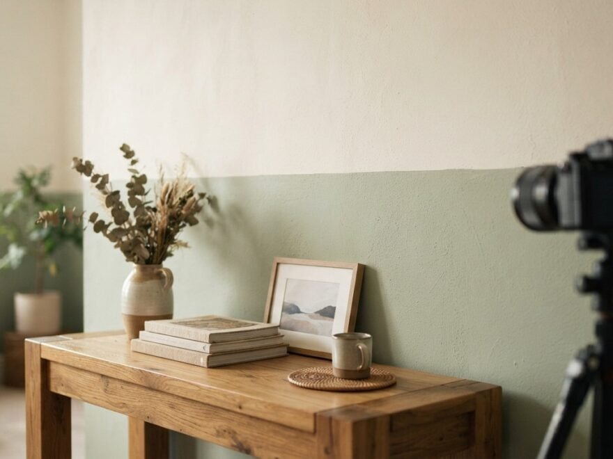
Two tone walls are having a real moment in home design right now, and it’s easy to see why. This simple painting technique lets you play with color, depth, and mood without spending a fortune or hiring a professional. Whether you’re working with a small apartment or a spacious living room, splitting your wall into two shades can make a space feel taller, cozier, or more modern depending on how you play with the split. Below are 24 creative two tone wall ideas that fit almost any budget, style, and skill level. Each one comes with practical tips so you can recreate the look yourself this weekend.
1. Classic Horizontal Split Wall
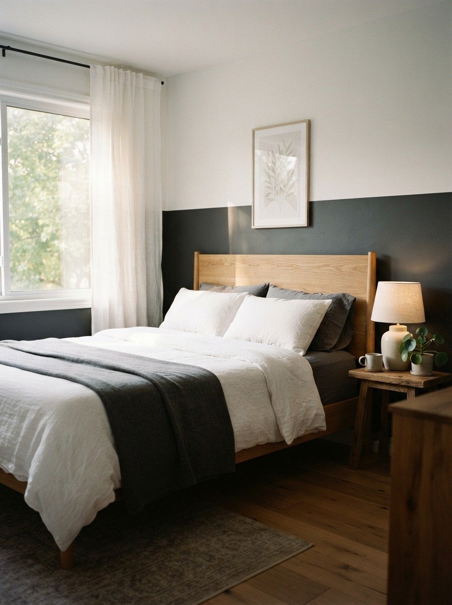
This is the easiest two tone style to start with. Pick two shades, decide where the split goes, and tape off the line. Most people place the divide around waist height or slightly above. A darker color on the bottom grounds the room and hides scuffs near furniture. A lighter shade on top keeps the ceiling feeling open. Use painter’s tape and a level to get a clean, straight line. Budget wise, this only needs two small cans of paint and a roll of tape. Try pairing navy with pale blue, or terracotta with cream for a warm look. This works well behind a bed, a sofa, or even in a hallway. If you’re short on time, do the bottom half first and let it dry fully before adding tape for the top color. It avoids bleeding and smudging. Beginners often worry about the line looking messy, but a good quality tape and steady hand fix most of that. This idea alone can transform a plain rental wall into something that feels designed, without asking your landlord for permission to knock anything down.
2. Diagonal Color Block Wall
3. Half and Half Vertical Wall
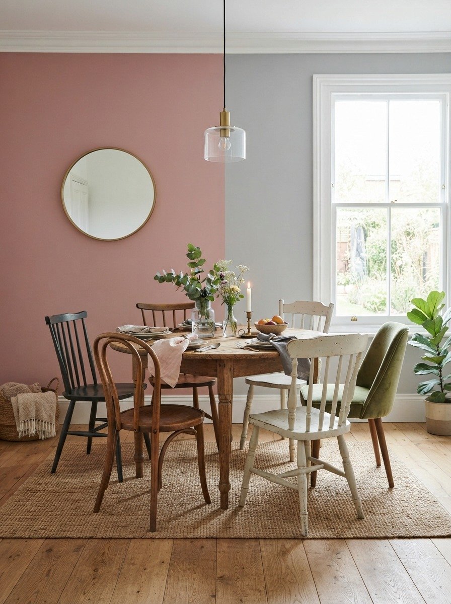
A vertical split feels less common than horizontal, which makes it stand out in a good way. This style works best on narrower walls where the two colors can each get enough space to shine. Measure the wall’s width and mark the center point before taping. Choose colors that complement rather than clash, like a muted rose next to a cool gray. This combination feels calm rather than chaotic. On a budget, sample sized paint pots are often enough to cover a single wall split this way. Vertical splits also work in entryways, making a narrow hallway feel less like a tunnel. Add a mirror or a row of hooks along the seam to draw the eye naturally. If you’re renting, this is a low risk way to experiment with color since repainting back to a single shade later is simple. Try this in a home library, dining nook, or reading corner for a subtle but interesting backdrop that still feels calm and livable day to day.
4. Arch Shaped Accent Wall
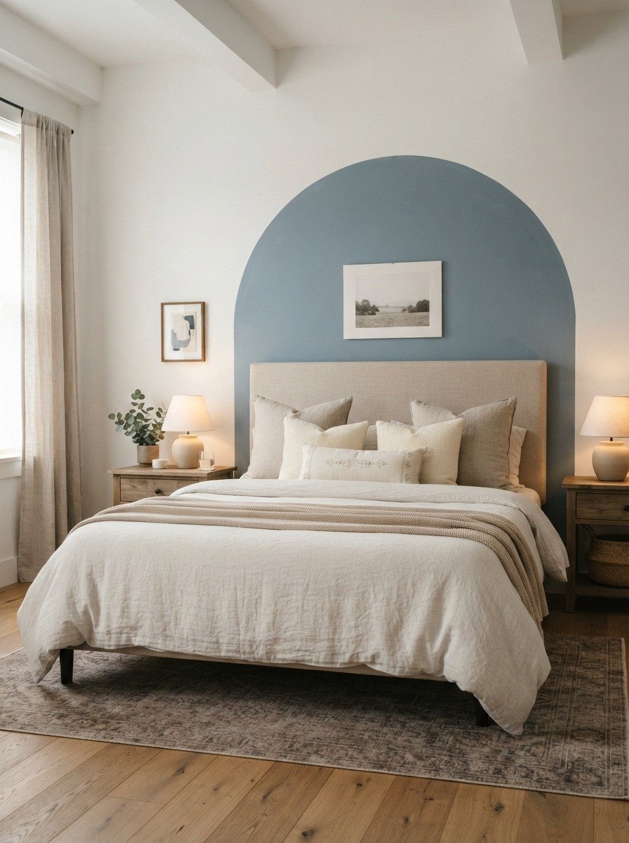
Arch shapes soften a room instantly. This idea works especially well behind a bed or a sofa where you want a focal point without covering the entire wall. Sketch your arch lightly with a pencil, using a large plate or string and pin as a guide for the curve. Tape along the curved line in small sections since curved tape needs shorter pieces to bend properly. Fill in the arch with your accent color and leave the rest of the wall in its base shade. A budget tip here is to keep the arch modest in size, since smaller shapes use less paint and less tape. Muted colors like terracotta, sage, or blush work beautifully for this look. This idea is popular right now because it adds softness to a room full of straight lines and hard furniture edges. It also pairs nicely with rattan or wooden furniture for a natural, relaxed feel. Even a small bedroom can handle this since the arch draws the eye upward rather than making the space feel boxed in.
5. Color Blocked Squares
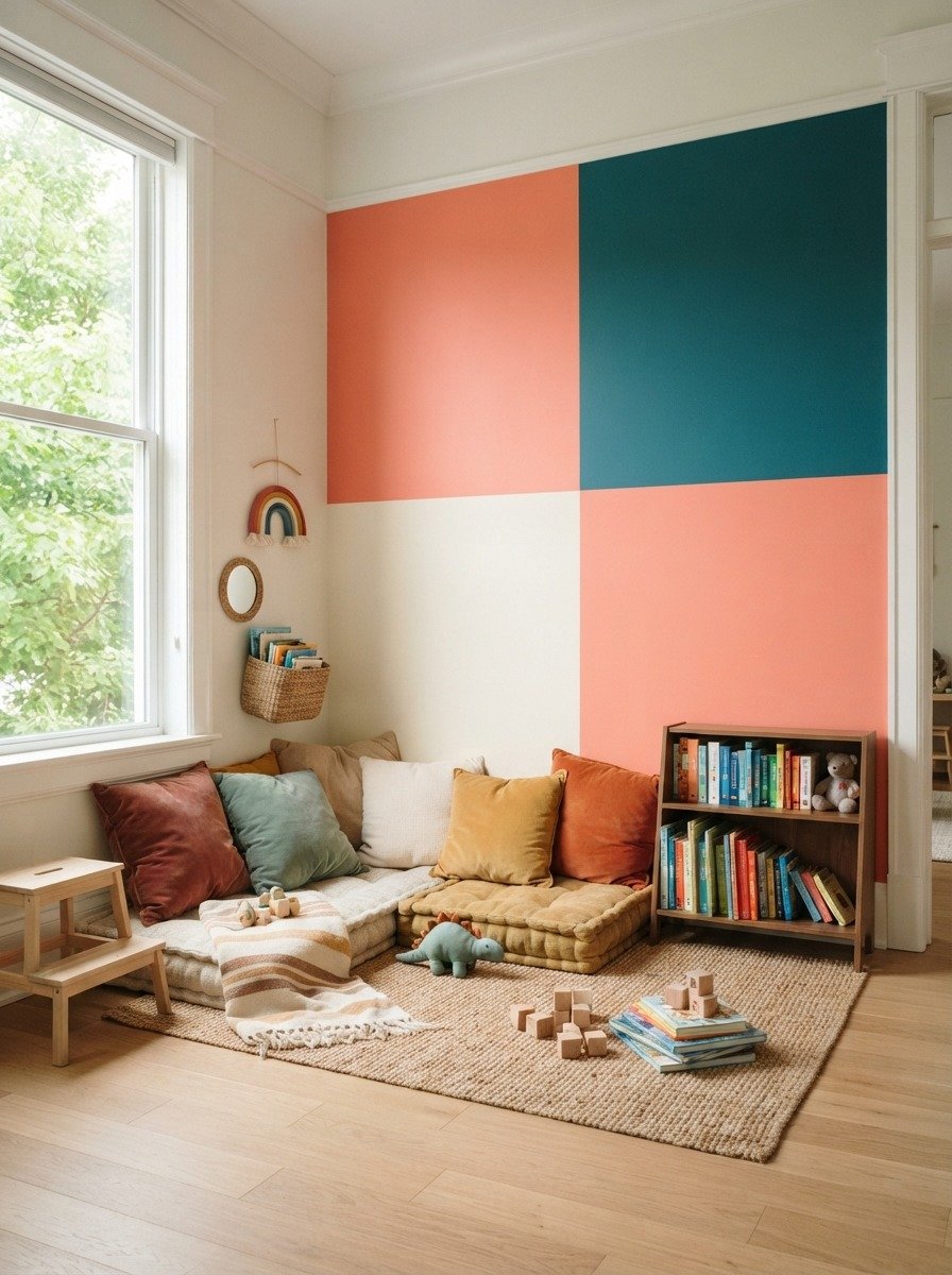
Square color blocks give a playful, modern feel that works well in kids rooms or creative spaces. Instead of splitting the wall into two even halves, this idea breaks it into a grid of colored squares. Measure and mark your grid lightly with pencil first. Keep the squares even in size for a clean look, or vary them slightly for something more artistic. A budget friendly approach is to use sample pots of paint since each square only needs a small amount. Stick to two or three colors so the wall doesn’t feel too busy. This idea works great behind a bunk bed, a study corner, or a play area. Kids often enjoy helping paint simple squares, making this a fun weekend family project. If you want something calmer, choose colors from the same family, like different shades of blue or green. The squares create visual interest without needing any extra decor on the wall itself, which also saves money on artwork or frames.
6. Ombre Fade Wall
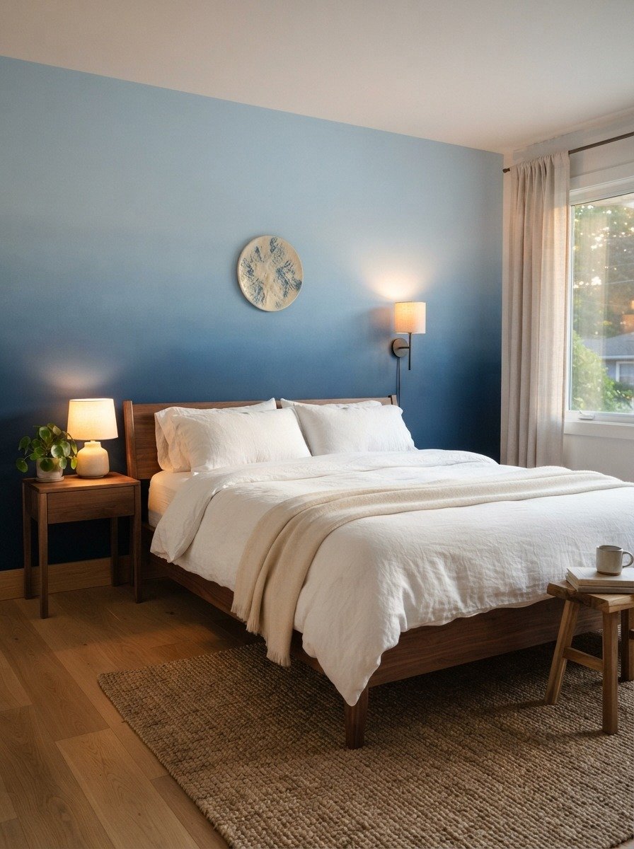
Ombre walls take a bit more effort but create a dreamy, gallery like effect. This works by blending two or three shades of the same color family into each other rather than using a hard line. Start with your darkest shade at the bottom and your lightest at the top. Blend the middle section while the paint is still wet using a dry brush or sponge in circular motions. Practice on a scrap board first if you’re new to this technique. A budget tip is to buy sample sizes of three shades instead of full cans, since a single wall doesn’t need much paint. This idea works beautifully in bedrooms and nurseries where a soft, calming mood matters most. Blues, purples, and pinks all fade nicely this way. Keep your furniture and decor simple so the wall itself becomes the main visual feature. Ombre walls also photograph well in soft natural light, making them a favorite for home decor content and interior photography.
7. Two Tone Wall With a Chair Rail Line
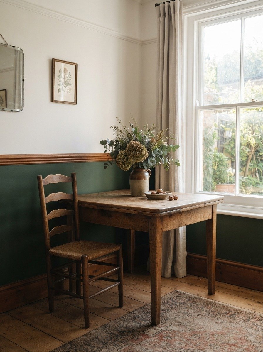
Adding a chair rail gives your two tone wall a more finished, classic look. Instead of taping a straight line, you install a thin strip of wood molding at the split point. This hides small paint imperfections and adds texture to the wall. Chair rails are inexpensive at most hardware stores and can be cut to size and attached with adhesive or small nails. Paint below the rail in a deeper shade to protect against scuffs from chairs, and paint above in a lighter tone to keep the room feeling open. This idea suits dining rooms, hallways, and entryways especially well. A budget tip is to choose paintable MDF molding instead of solid wood, since it costs less and takes paint just as well. This look works with almost any color pairing, from moody greens to soft neutrals. It gives a rental or older home a slightly more polished, traditional feel without a full renovation.
8. Bold Contrast Wall Behind Open Shelving
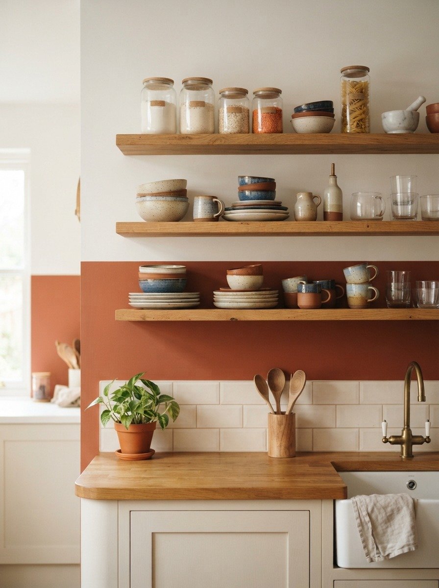
Open shelving looks even better against a two tone backdrop. This idea works in kitchens, pantries, or dining nooks where you already have shelves mounted or plan to add them. Paint the wall behind the shelf area in a bold contrasting color and keep the rest of the wall lighter. This makes your shelved items pop visually without needing to buy new decor. A budget tip is to only paint the section directly behind the shelves rather than the whole wall, which saves paint and time. Terracotta, deep green, or navy all work nicely against white dishes and glass jars. This idea also makes a small kitchen feel more designed and intentional. If you’re renting, removable wallpaper in a similar two tone pattern can achieve the same effect without touching the paint at all. Keep your shelf styling simple, a few plants, some stacked bowls, and a jar or two, so the wall color still gets to shine through.
9. Geometric Triangle Accent
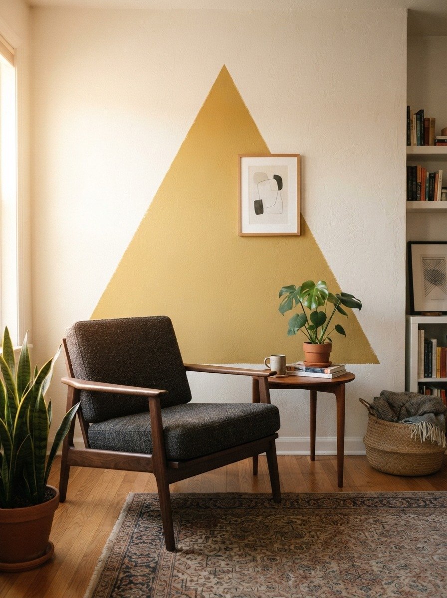
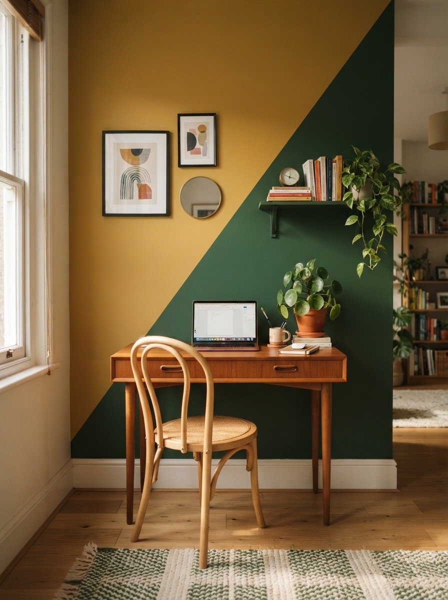
Triangles bring a modern, geometric feel without being too complicated to paint. Choose one large triangle shape and position it off center for visual interest. Mark your triangle points with a pencil and connect them using a ruler or long straight edge, then tape along the lines. Fill in with your accent color while the rest of the wall stays neutral. A budget tip is to use sample paint since one triangle usually needs very little coverage. This idea works well in living rooms, studies, or even bathrooms as a small feature wall. Mustard, terracotta, and deep teal all work beautifully as triangle accents against white or cream backgrounds. Keep the rest of your room decor minimal so the shape stays the focal point. This is also an easy weekend project since triangles have straight edges that are simple to tape and paint cleanly, even for total beginners with no prior painting experience.
10. Soft Pastel Duo Wall
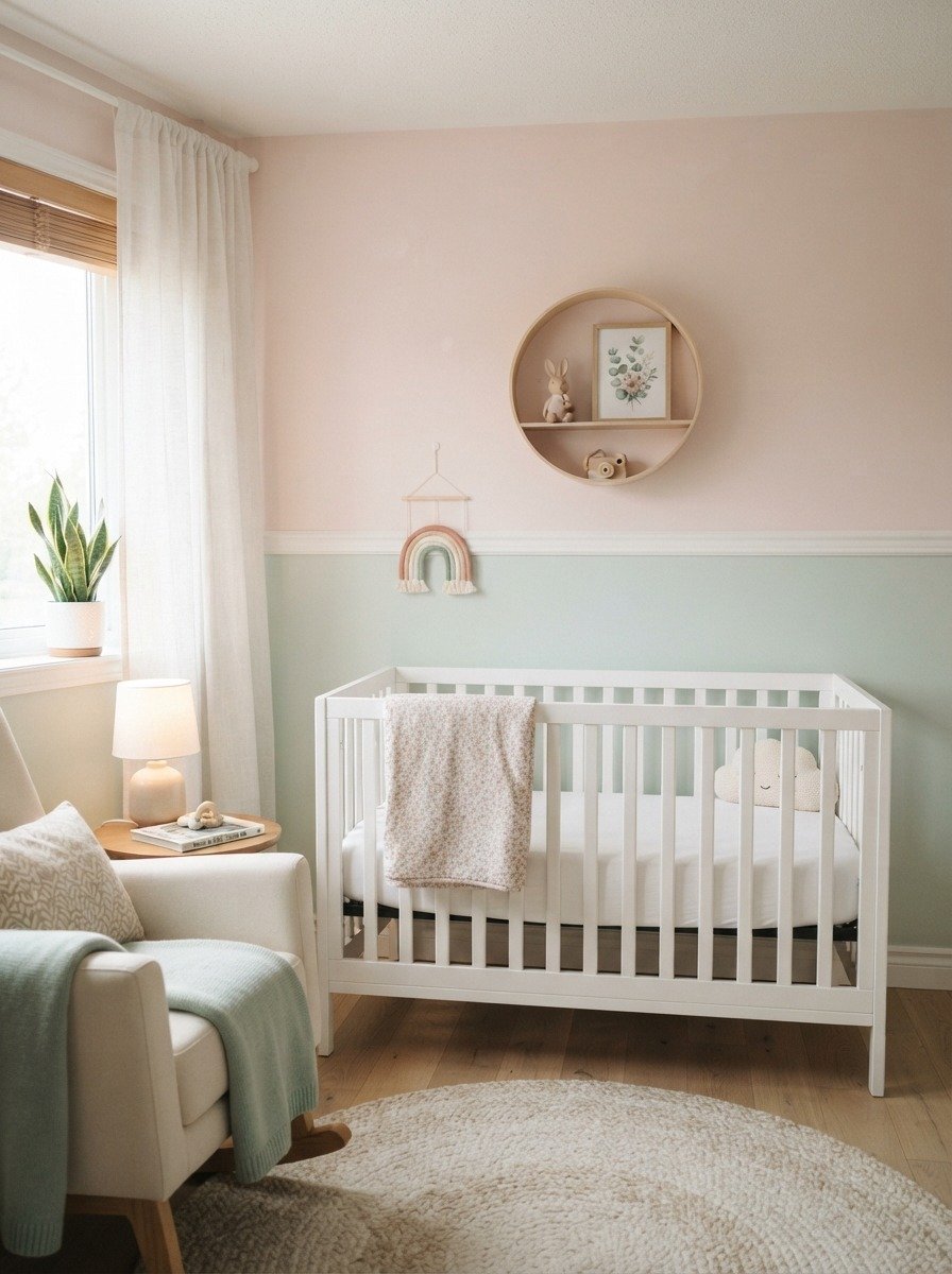
Pastel two tone walls feel gentle and calming, making them a favorite for nurseries and children’s rooms. Choose two soft, muted shades that complement each other rather than clash. Blush pink with mint green, or lavender with pale yellow, both work nicely. Split the wall horizontally at around chest height for a balanced look. A budget tip is to buy the smallest available paint cans, since pastel colors usually only need one coat to look even and soft. This idea creates a soothing environment perfect for a baby’s room or a young child’s bedroom. Keep the furniture simple and light colored so the wall colors stay soft and calming rather than overwhelming. Adding a small shelf with a few wooden toys or books finishes the look nicely without extra cost. This style also works well if you plan to change the room’s theme later since pastel shades are easy to paint over or adjust as your child grows.
11. Moody Dark Accent With Light Base
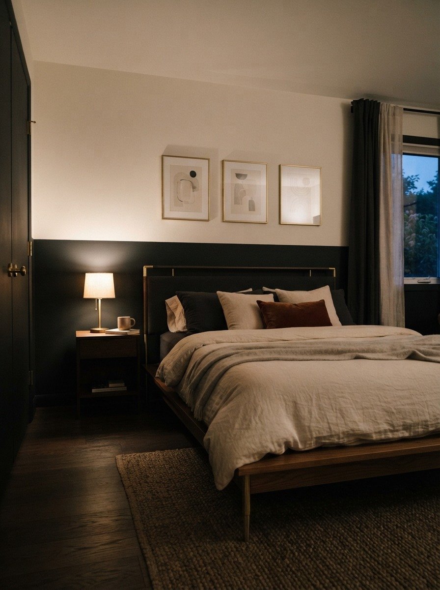
Dark and moody accents create a cozy, intimate feel that works especially well in bedrooms. Paint the lower two thirds of the wall in a deep shade like charcoal, black, or deep navy, and leave the top third in a soft white or cream. This combination grounds the room while still keeping the ceiling feeling tall and open. A budget tip is to use a matte finish paint for the dark section since it hides brush strokes and imperfections better than glossy finishes. Add warm lighting like a lamp or string lights to soften the darker tone at night. This look pairs beautifully with brass or gold accents, wooden furniture, and textured linens. It also works in a home office or reading nook if you want a calm, focused atmosphere. Dark two tone walls tend to photograph beautifully in evening light, making this a popular choice for cozy bedroom inspiration across home decor pages and blogs.
12. Wavy Line Two Tone Wall
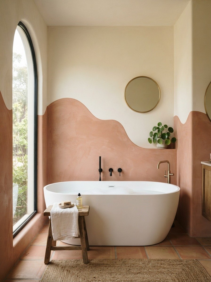
Wavy lines add a playful, organic feel compared to the usual straight split. Instead of taping a straight edge, draw a loose wave pattern freehand or using a flexible ruler. This style feels less structured and works great in bathrooms, kids rooms, or casual living spaces. A budget tip is to practice your wave pattern on paper first so you feel confident before painting the actual wall. Keep the wave gentle rather than sharp for a more relaxed look. Terracotta and cream, or sage and white, both work nicely for this style. This idea is especially popular in small bathrooms where a playful wall can make the space feel more personal. If you’re worried about symmetry, remember that wavy lines are meant to look natural and slightly imperfect, which actually makes the final result feel more handmade and charming rather than mistake filled.
13. Two Tone Wall With Exposed Brick Combo
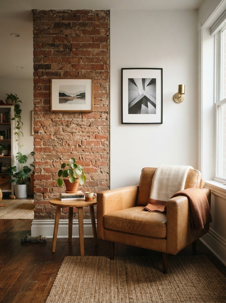
If your space already has exposed brick, you can pair it with a smooth painted section for an easy two tone effect. Leave the brick side untouched and paint the plaster or drywall section beside it in a soft neutral shade like white, cream, or light gray. This combination gives texture and contrast without much extra work. A budget tip is that this idea often needs less paint than a full two tone wall since only half the surface requires painting at all. This look works especially well in loft style apartments, exposed brick living rooms, or converted industrial spaces. Add simple furniture in leather or wood tones to match the raw, textured feel of the brick. This idea also suits renters who already have a brick feature wall but want to soften it slightly with a painted contrast beside it, creating balance between rustic and modern styles in the same room.
14. Split Wall With Floating Shelves
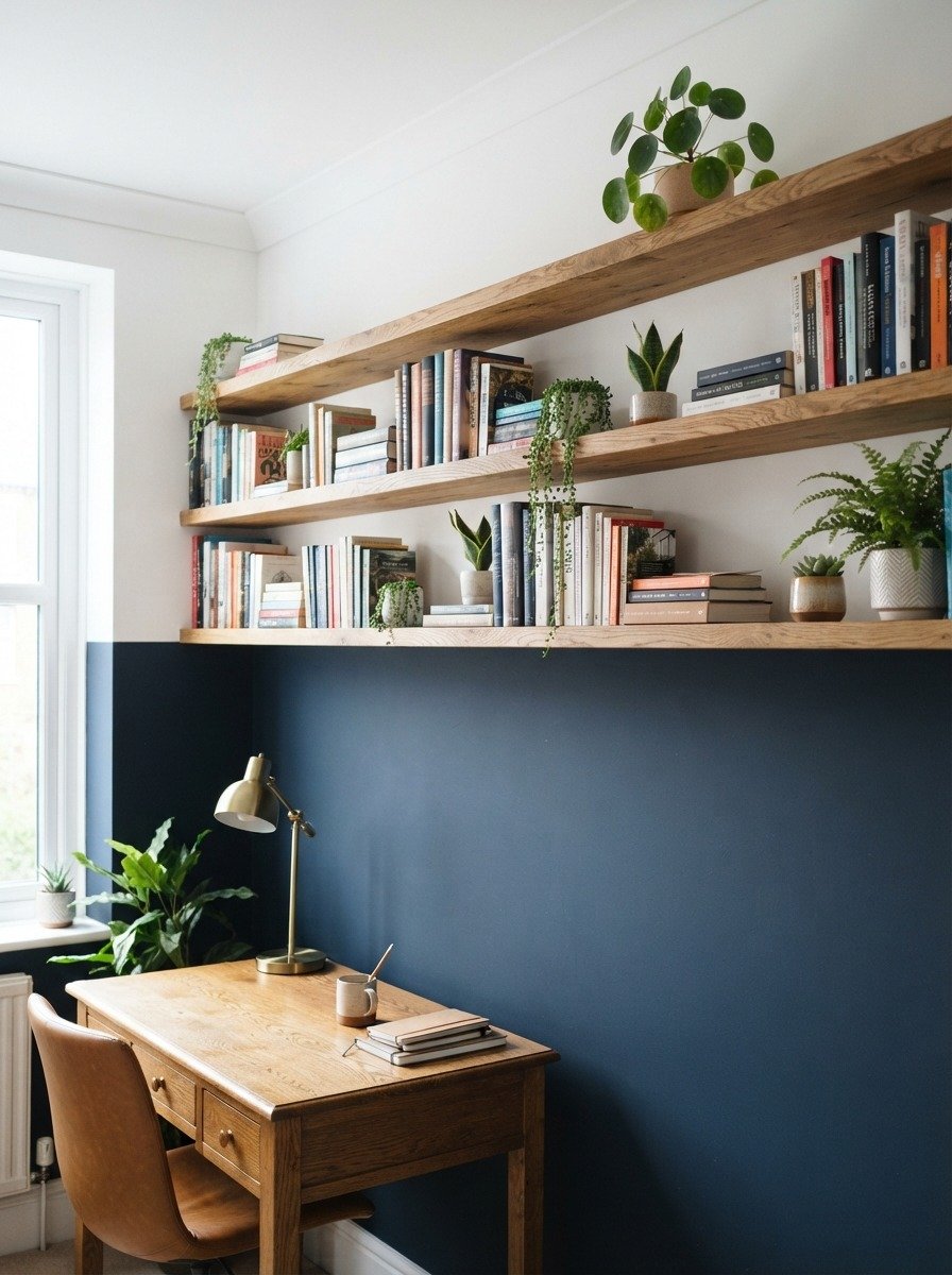
Floating shelves placed right along the seam of your two tone wall create a natural divide and functional decor at the same time. Paint your wall in two contrasting colors, then mount simple wooden shelves exactly where the colors meet. This adds storage while making the transition between colors feel intentional rather than abrupt. A budget tip is to use pre cut floating shelf kits from a hardware store instead of custom carpentry, which saves both money and time. Navy and white, or forest green and cream, both work nicely for this combination. This idea suits home offices, studies, or living rooms where you want both storage and style. Style your shelves with a few books, a small plant, and one personal object rather than overcrowding them. This keeps the wall feeling curated and clean rather than cluttered, while still giving you a practical place to store everyday items.
15. Two Tone Wall in a Kids Bedroom With Cloud Cutouts
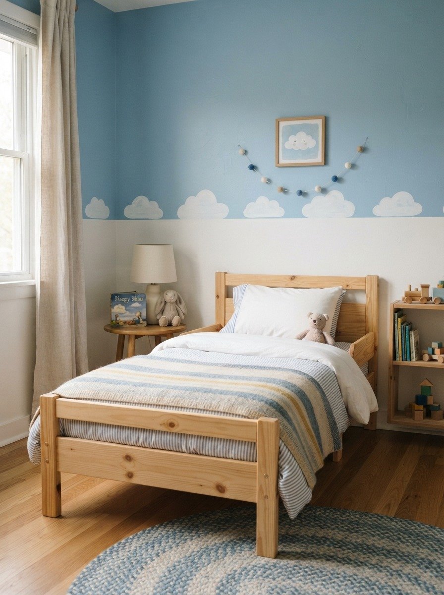
Cloud cutouts along the seam of a two tone wall bring a playful touch to a child’s room. Paint your base colors first, light blue below and white above, or reverse it depending on preference. Once dry, use a simple cloud stencil or freehand rounded shapes to paint a few clouds right along the divide. A budget tip is to make your own stencil from cardboard rather than buying one, since clouds are simple rounded shapes that don’t need precision. Keep the clouds small and scattered rather than covering the whole seam, which keeps the look light and airy. This idea works beautifully for toddler rooms or shared kids spaces. Add a simple rug and some soft bedding in matching blue and white tones to complete the theme. This is also an easy project to involve older kids in, letting them help paint their own cloud shapes for a personal touch.
16. Warm Terracotta and Cream Living Room Wall
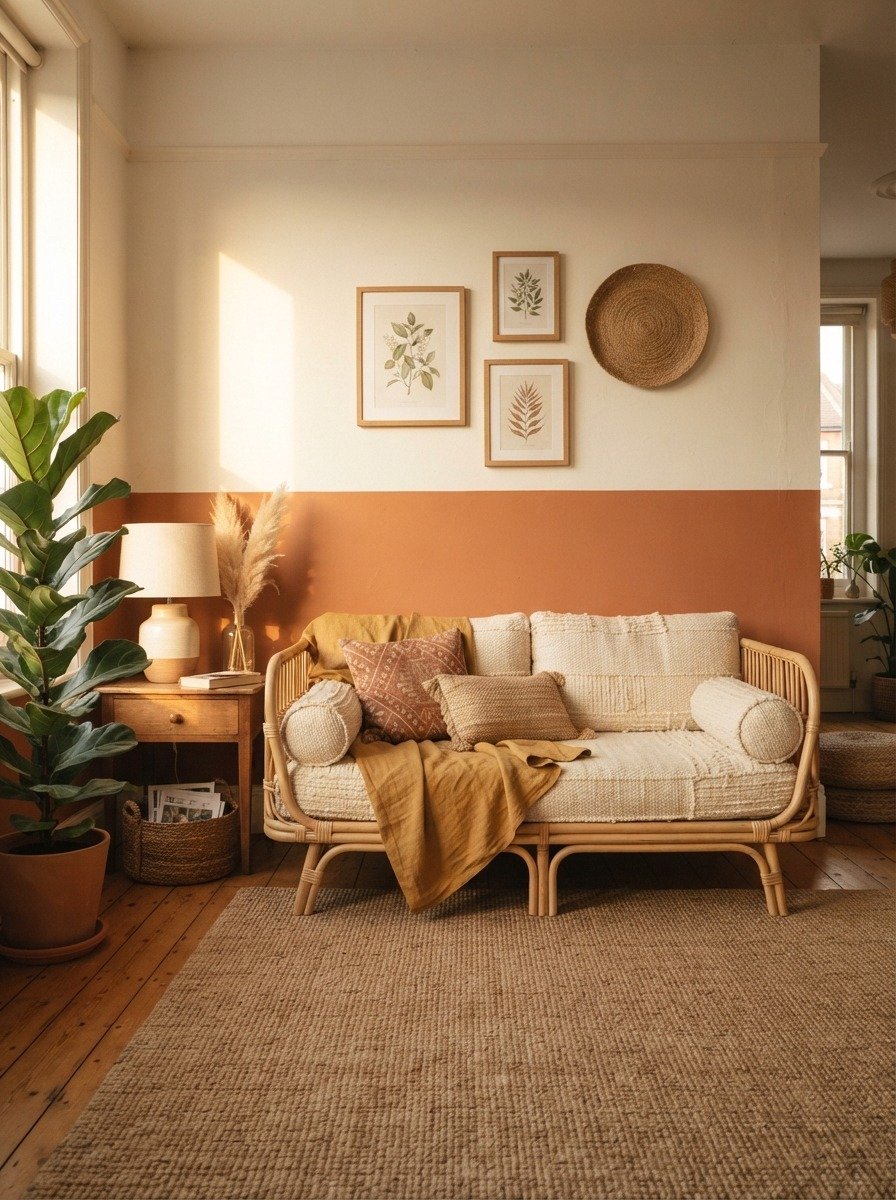
Terracotta and cream is one of the most popular color pairings for two tone walls right now, and it fits almost any living room style. The warm terracotta tone grounds the space and works especially well with wooden and rattan furniture. Cream on top keeps the room feeling bright and airy. Split your wall around waist height, or slightly lower if you have tall ceilings and want the terracotta to feel more dominant. A budget tip is to test small paint swatches on the wall first, since terracotta shades vary widely and lighting changes how warm or muted they appear. This combination pairs beautifully with woven textures, wooden shelves, and green plants. It works in apartments, houses, and even rental spaces since terracotta is easy to paint over later if needed. This look feels earthy and calm, making it a great choice for a relaxed, welcoming living room.
17. Two Tone Accent Behind a Gallery Wall
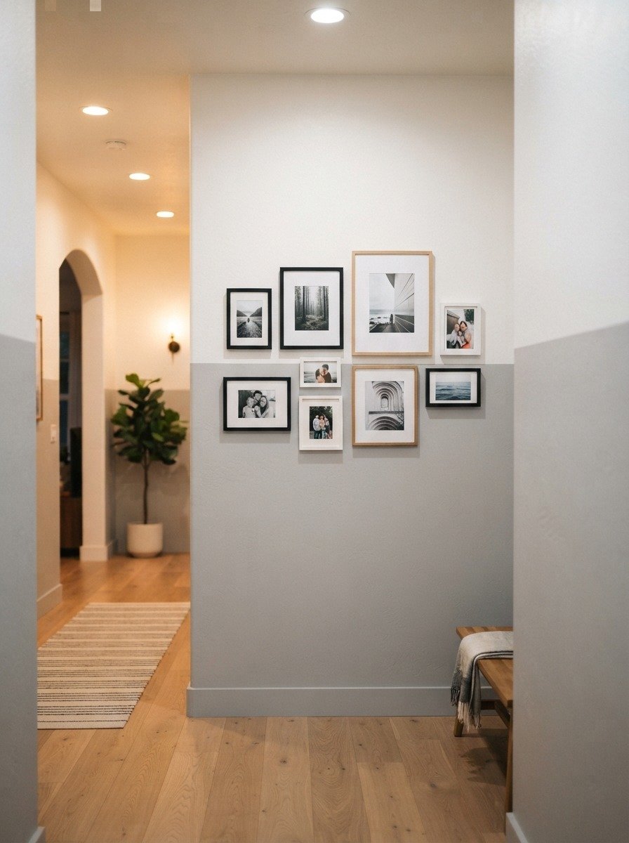
Combining a two tone wall with a gallery of framed photos creates a layered, personal look. Paint your base colors first, then arrange your frames so they sit across both color sections, tying the two tones together visually. A budget tip is to use frames you already own rather than buying new ones, and to print photos at home or through an affordable online service instead of a professional print shop. This idea works especially well in hallways, staircases, and entryways where you want both color and personality. Soft gray and white keep the space feeling calm while still allowing the photos to stand out. Arrange frames in a loose grid or a slightly staggered pattern rather than a strict straight line for a more relaxed feel. This combination gives visitors something interesting to look at as they walk through your home, while the two tone wall adds depth behind the display.
18. Two Tone Wall With a Mirror Feature
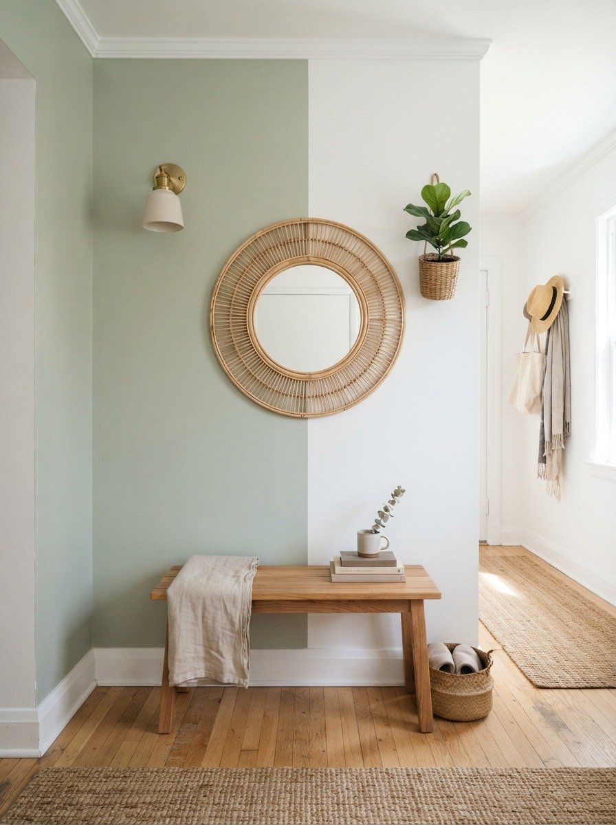
Placing a mirror right along the seam of your two tone wall draws the eye naturally to the color transition. Choose a round or oval mirror with a simple frame in wood, rattan, or brass to match your overall style. A budget tip is to look for secondhand mirrors at thrift stores or online marketplaces rather than buying new, since frames can always be repainted to match your color scheme. Sage green and white feels fresh and calming for an entryway, though you can adjust to any color pairing you prefer. This idea works especially well in small entryways where a mirror also helps the space feel larger and brighter. Add a small bench or a few hooks nearby for practical storage. This combination gives your entryway both function and style without needing a large budget or extensive renovation work.
Conclusion
Two tone walls give you an easy way to change the entire feel of a room without a full renovation budget or a long timeline. From simple horizontal splits to playful cloud cutouts and warm wood paneling, there is a style here for almost every room, taste, and skill level. Start small if you’re new to painting, pick two colors you already love, and choose one wall to experiment on first. Once you see how much personality a simple color split can add, you’ll likely want to bring this technique into other rooms of your home too. Grab your paint, tape, and a free weekend, and turn one plain wall into a feature you’ll enjoy looking at every single day.