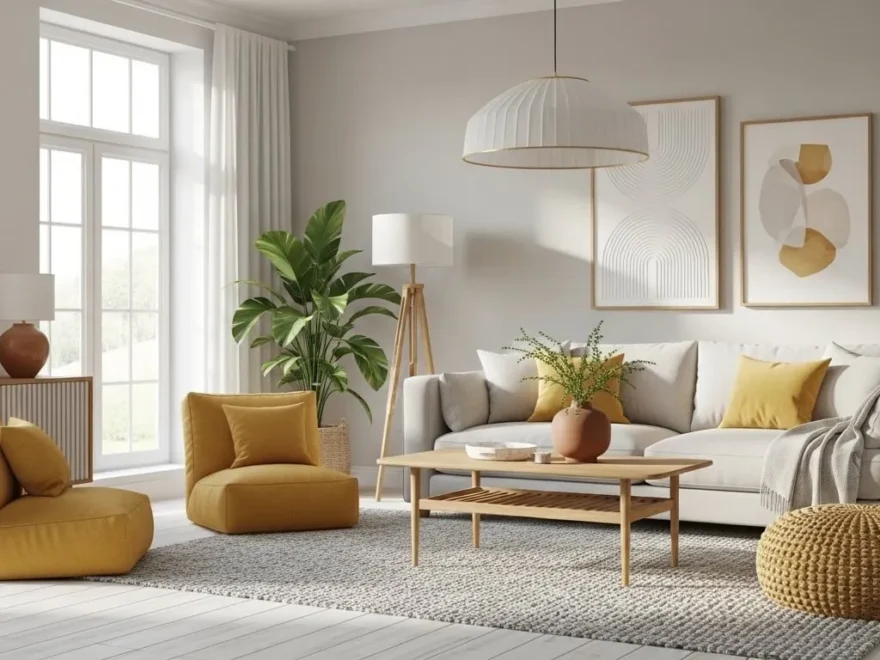
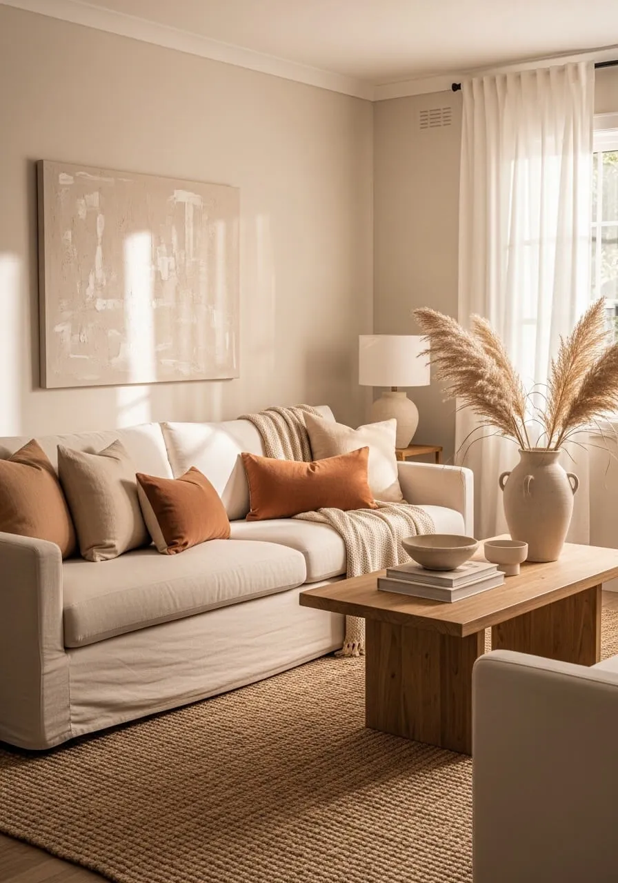
Here is exactly how to decorate with neutral colors and still make every room feel alive, layered, and genuinely striking.
Build Your Neutral Palette the Right Way
The first mistake most people make with neutral decorating is treating all neutrals as interchangeable. They are not. Neutrals have undertones that either work harmoniously together or clash in subtle ways that make a room feel off without the homeowner being able to explain why.
Warm neutrals include tones with yellow, red, or orange undertones. Think creamy whites, soft beiges, warm taupes, caramel, and terracotta. These tones feel cozy, inviting, and grounded. They work beautifully together and create rooms that feel like a warm embrace.
Cool neutrals include tones with blue, green, or grey undertones. Think crisp white, cool grey, slate, soft sage, and greige that leans more grey than beige. These tones feel calm, airy, and modern. They work beautifully together but can feel cold if used without enough texture and warmth.
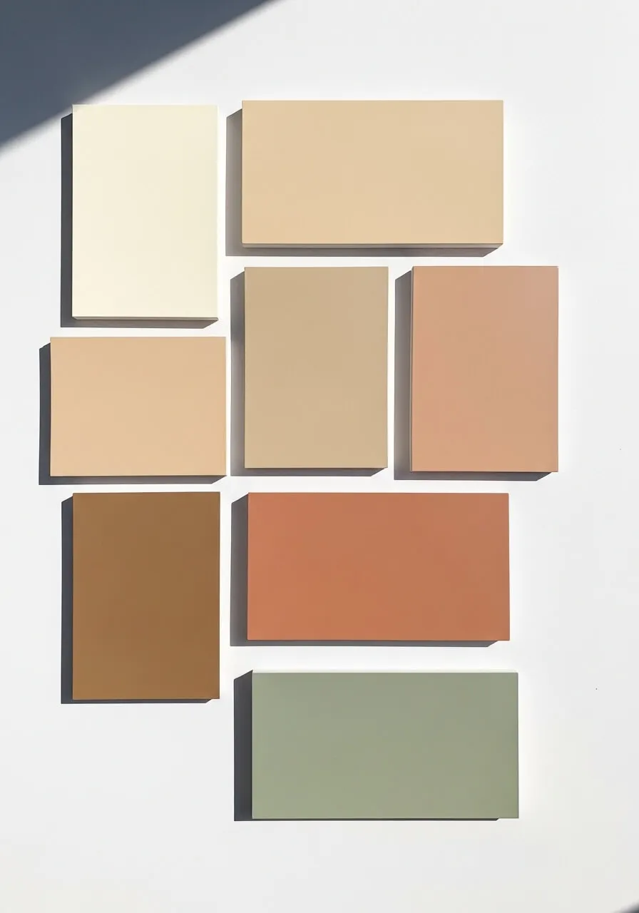
The rule that matters most is to pick one family and stay within it. Mixing warm and cool neutrals in the same room creates visual tension that makes the space feel unsettled. Choose warm or cool and then layer different shades and tones from within that same family for a result that feels cohesive and considered.
Start with the largest surfaces first. Walls, floors, and large furniture pieces set the foundation of the palette. Everything else builds on top of those anchor choices.
Layer Textures to Create Visual Interest
Texture is the single most important tool in neutral decorating. When you remove bold color from a room, texture takes over the job of creating visual depth and interest. A neutral room with no texture looks flat, cold, and unfinished. A neutral room with layers of different textures looks rich, warm, and professionally designed.
Think about what each surface feels like and how that texture reads visually from across the room. Smooth surfaces like polished stone, glass, and lacquered wood reflect light and add a clean, modern quality. Rough and natural surfaces like jute, linen, raw wood, woven baskets, and bouclé fabric absorb light and add warmth and coziness.
The most visually interesting neutral rooms mix both types deliberately. A smooth marble coffee table paired with a chunky jute rug underneath. A crisp linen sofa with a bouclé throw draped over one arm. Polished brass hardware on raw oak cabinets. These contrasts create the visual movement that makes a neutral room feel dynamic rather than static.
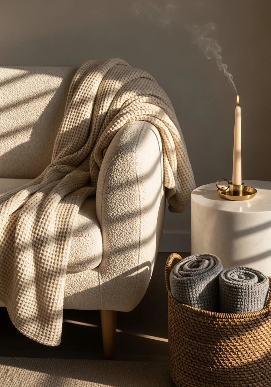
Bedding, cushions, curtains, and rugs are the easiest and most affordable places to build texture into a neutral room. Swap flat, matted fabrics for ones with visible weave, pile, or knit and the difference is immediate and dramatic.
Add Depth with Tonal Variation and Accents
A neutral palette does not mean every surface needs to be the same shade of beige. Tonal variation, using different depths and intensities of the same color family, is what gives a neutral room its dimension and stops it from looking one-dimensional.
Layer your neutrals from lightest to darkest as you move through the room. Light walls, medium tone furniture, a slightly deeper rug, and dark wood or metal accents in the accessories creates a natural visual hierarchy that draws the eye through the space and makes everything feel considered.
Strategic accent tones bring a neutral room to life without introducing bold color. Warm terracotta, dusty rose, muted olive green, and deep camel all function as accents within a neutral palette because they are soft enough not to dominate but distinct enough to add a point of visual interest that makes the eye stop and appreciate the detail.
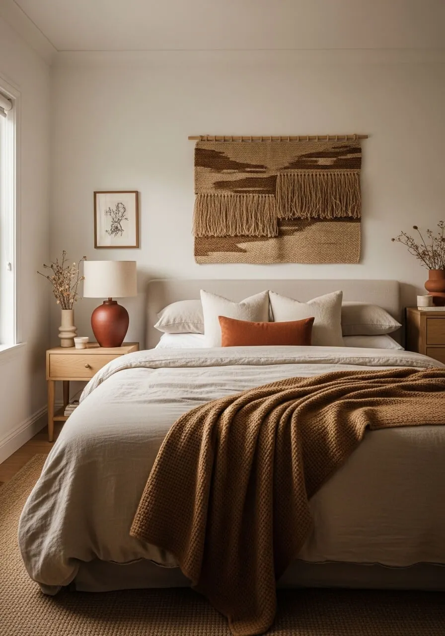
Statement pieces in natural materials serve as accents in a neutral room without requiring any color at all. A sculptural ceramic vase, an oversized woven pendant light, a live edge wooden shelf, or a cluster of varied height candle holders all create visual focal points that make the eye pause and engage with the space.
Frequently Asked Questions
How do I stop a neutral room from looking boring? The answer is almost always texture and tonal variation. A room that uses only one or two flat neutral tones with no variation in texture will always look dull. Introduce at least four to five different textures across the soft furnishings, hard surfaces, and accessories. Add accent tones like terracotta, dusty rose, or muted olive that sit within the neutral family but add just enough contrast to create visual interest without disrupting the calm palette.
Can neutral colors work in a dark room with little natural light? Yes but the approach needs adjusting. In a darker room, choose neutrals with warm undertones like cream, warm white, and soft camel rather than cool greys or stark white which look flat and cold without natural light to bring them alive. Add multiple layers of artificial warm-toned lighting including floor lamps, table lamps, and candles to compensate for the lack of daylight. Mirrors placed strategically to reflect any available light sources also help significantly.
What accent colors work best with a neutral palette? The accents that work most harmoniously within a neutral palette are tones that are muted and earthy rather than bright and saturated. Terracotta, dusty rose, sage green, muted olive, warm camel, and deep cream all sit naturally within a neutral scheme without overpowering it. These accent tones can be introduced through cushions, a single statement lamp, a throw, or a ceramic vase without committing to a full color change in the room.
How many neutral tones should I use in one room? Three to five tones from within the same neutral family is the most effective range for most rooms. One light tone for the walls, one medium tone for the large furniture pieces, one slightly deeper tone for the rug or floor covering, and one or two accent tones in the accessories and textiles. Going beyond five tones in a small to medium sized room starts to feel busy and loses the calm, cohesive quality that makes neutral decorating so appealing in the first place.
Let Your Neutrals Do the Talking
A beautifully decorated neutral room is one of the most timeless and genuinely impressive things you can create in a home. It takes thought, intention, and a willingness to invest in texture and quality over color and quantity. Start by deciding whether you are working with warm or cool neutrals and build everything outward from that foundation. Add texture at every layer, vary your tones from light to deep, and let one or two accent pieces bring the focal points to life. Save this guide and come back to it every time you are ready to add another layer to your neutral home.